Color
The Coupa community’s potential is limitless. Our future is brighter than our past. Together, we’re building a platform for performance and purpose, bringing people together through technology to make every dollar matter. We reflect that spirit with colors that are derived from the blue sky — a limitless horizon of hues that pair together to express our brand.

We’re approachable, vibrant, and fun. Our color palette brings these attributes to life through energetic, happy hues. They help define us, differentiate us, communicate meaning, and connect us with our audience. These colors bring the Coupa vision to life through anchoring in a foundational core set of colors while having the flexibility to expand into a palette that is effective, equitable, and sustainable through all applications.
Core
Our core colors are representative of our core values. While neutral in aesthetic they are compromised of neutrals, white, and blues this creates a system that can easily adapt to different content and messaging tones.
Strive
rgb(3, 27, 120)
cmyk(100, 96, 21, 16)
Focus
rgb(21, 101, 192)
cmyk(87, 62, 0, 0)
Success
rgb(26, 180, 255)
cmyk(64, 14, 0, 0)
Neutrals
Neutrals have varying tones that allow for the appropriate level of balance to both the core and enhanced colors. Typically they are used for text and subtle backgrounds when we don’t want to draw too much attention to a particular touchpoint or convey information.
Enhanced
Our enhanced colors contains a variety of colors to keep things fresh and interesting. We lean on these colors more frequently when brand awareness is high, or on our own properties where we control the surrounding environment. When used in conjunction with our core colors or neutrals, these colors allow for the full expression of our brand when appropriate to the content or message.
These colors along with our expanded palette are meant to represent the expansive range of the Coupa Community.
Gradients
Colors are meant to be paired harmoniously.
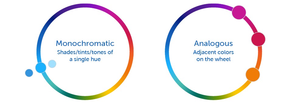
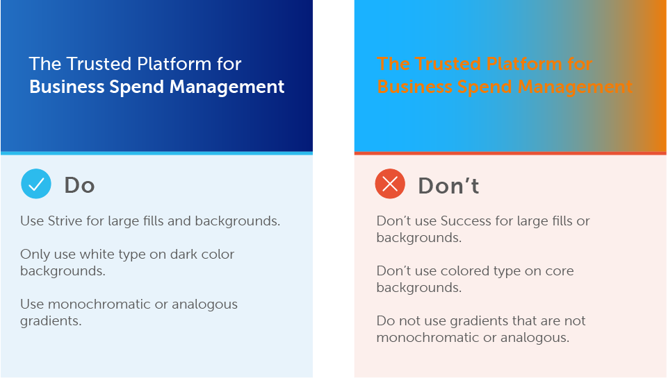
Color harmony is key to creating an aesthetically pleasing gradient. When pairing colors together, we mainly stick to: monochromatic and analogous.

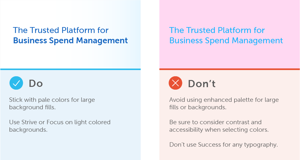
Color Usage


